

 ____________________________________________________________________


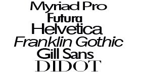
 Choosing a possible font for the mast head was possibly the hardest part for me. I wanted something that gave the magazine a clean edgy look, but also looked quite artistic. I played around with a few possibilites until I decided to use the same font that COMPLEX use for their mast head.


