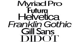
Tonight I looked at a variety of fonts that I felt would be appropriate for the style of magazine that I want to achieve.
Although i'm still unsure of the genre that I will be designing for I have a brief idea of the design and layout that I would like my finished product to look like.
These are a few fonts, that I am considering using as they help to incorporate the clean crisp look that I want out of my magazine.

Some of the fonts that i've been looking at are already well known, such as DIDOT, which is used for vogue, Futura is used by various brands as their chosen font.
Although fairly similar I like these fonts as they are all quite bold, and will help to make my magazine more appealing.

0 comments:
Post a Comment