
Pre-Production
For this task we worked by ourselves, we were asked to create a front page and contents page suitable for a school magazine. We had to include a mid shot photo which strictly was not allowed to be a stock photo.
We firstly had to draw up an original plan of our desired magazine cover. It had to include a photo, a headline and also side headings and possible . I drew and original picture of what I felt I should look like, to represent students at Lutterworth College. I labelled my magazine to show who it will be aimed at and the type of people would be actually interested in reading my magazine. I took the name of my magazine from the culture magazine COMPLEX, using their interesting bold style of titles. I decided upon EXCEL@LC as I felt this was a good play on words, excel could be taken just as a magazine titles, as well as achieving in school.
Production
There were quite a few skills that I acquired during this task. It is now a lot clearer that I need to keep my designs clear so that they are easier for me and others to understand. When I come to do this as my final piece, I know that my initial sketch will be considerably clearer so that it is easier for me to recreate on PhotoShop. Knowing your audience is a key part in designing a magazine. I now know that keeping all of my information relevant to the group is key to creating an enjoyable magazine
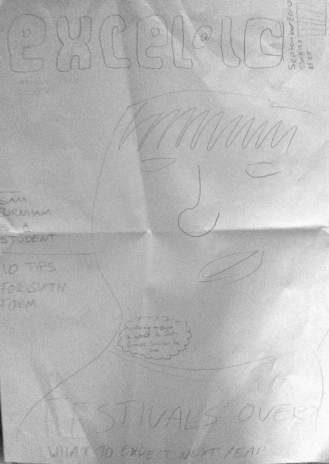
This is my initial magazine cover drawing. As you can see it's not incredibly clear, but it included enough detail for me to complete the task. When I come to draw the plan for my final magazine I will make my plan a lot clearer and bolder.
The first thing I had to do to get my magazine started, was take an array of photos. As I had a vague idea of how I wanted the person on my front cover to look, I decided it would be easier if I modelled myself. I took a selection of photos, around 15, and then chose 3 of my favourites. I then uploaded the photos onto my laptop, once I had decided which photo I was going to use for my front cover I quickly started to edit it in Photoshop.
Using photoshop, and the tool, magnetic lasso, I cut around the picture of me, making sure the edges were fairly neat.
 Choosing a possible font for the mast head was possibly the hardest part for me. I wanted something that gave the magazine a clean edgy look, but also looked quite artistic. I played around with a few possibilites until I decided to use the same font that COMPLEX use for their mast head.

Once I had chosen my mast head font, I needed to choose 2/3 other fonts that I could use for my front cover. I still wanted quite edgy fonts to give the magazine a style completely different to others. But they also had to be eligible and in keeping with the style of the magazine.

I then continued to put all of these features together. After adding dates, titles and a barcode, I decided that the cover was still quite bland. After looking at previous COMPLEX issues I decided to include paint splats to fill any empty space.

Using Photoshop was not much of a task as I have used it, and the many features before. But one of the main tasks that I had to overcome was the use of layers, as most of my previous Photoshop experience was just editing photos this was still quite a new feature. This was something that I felt I overcame quite quickly.
The main skill I acquired during production is my Photoshop skills, I know feel that I am a comfortable with most Photoshop features. This will help when I come to do my final magazine.
The main skill I acquired during production is my Photoshop skills, I know feel that I am a comfortable with most Photoshop features. This will help when I come to do my final magazine.


These our my initial drafts of both my front cover and contents page.
Finished Product


0 comments:
Post a Comment