DAZED & CONFUSED

I like the masthead used in these examples.
I will take inspiration from the font and sizes
used on DAZED front covers when designing
my own magazine front cover.

Possible Magazine Names

Excel
Crushed
Platoon
Eli
In the Air
Derezzed
SB
Burnham
Beginning
Begins
Representing
DC Chillin'
Institution

Colour Swatches

This is one possible selection of colours that
I would like to choose for throughout my
magazine. I like these colours as I feel they
would work well together to create a
professional finished product.

____________________________________________________________________

This is another possible selection of colours
I could use for my front cover, these colours
are a lot darker than the pervious ones, but
use the same base colour (black)
which would be a recurring colour through-
out a magazine.

Font choices

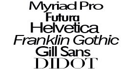
Tonight I looked at a variety of fonts that I felt would be appropriate for the style of magazine that I want to achieve.
Although i'm still unsure of the genre that I will be designing for I have a brief idea of the design and layout that I would like my finished product to look like.
These are a few fonts, that I am considering using as they help to incorporate the clean crisp look that I want out of my magazine.

Some of the fonts that i've been looking at are already well known, such as DIDOT, which is used for vogue, Futura is used by various brands as their chosen font.
Although fairly similar I like these fonts as they are all quite bold, and will help to make my magazine more appealing.